
So where to start?! How about with my 'must haves':
1) The stove (and the rangehood above it) MUST be fairly central in the North wall


3) The west wall of the kitchen (the one we extended) MUST be attractive (and kind of symmetrical), because it's visible from the main living area. Don't worry, the laundry tub won't stay there long term.

Therefore, we must have the hutch on that wall, and the fridge on the opposite wall (the one you can't see as well from the rest of the house).
4) We MUST have the dishwasher near the sink. Not only does that make sense from a plumbing perspective, but it would be completely impractical to have to move dirty dishes across the room to stack the dishwasher.
So those are THE MUSTS. Everything else has to work around those things, with as little wastage of the cupboards we've bought and as little additional carpentry as possible.
One evening recently after a day of painting I re-measured all of our cabinets and drew very sloppy diagrams of them.

I made a similar diagram of the room itself, just to be certain of what space I had to fit everything into, making sure I made note of the position of the existing windows.


They don't match the base cabinets exactly, but they're reasonably similar, and I figure if they're painted in the same colour that won't matter too much. We picked them up for a mere $200, which we thought was pretty fantastic. The doors are actually made of really beautiful Tasmanian Oak, so it's kind of a shame to be painting them, but leaving the timber raw would ruin the look of our kitchen, so painted they shall be.


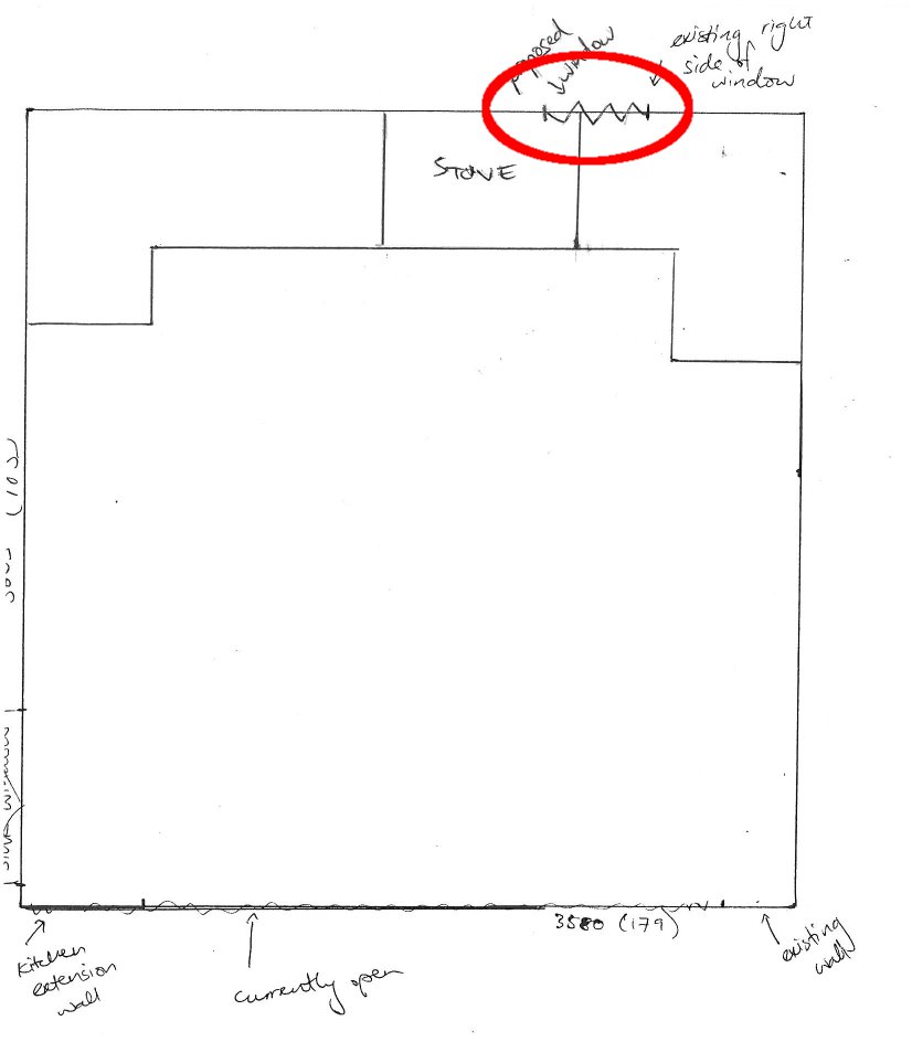
Two...the whole arrangement has the stove a little too far to the right, nowhere near central along the wall. The addition of the wall cabinets and fridge along that right wall (which is the plan) would just accentuate the off-centredness.
So! Back to the drawing board again. Fortunately I'd made a couple of copies of my blank room plan, so didn't have to erase anything, just moved onto a new copy. I tried flipping the two corner cabinets, and positioning the larger one on the right. And it was perfect! It almost perfectly centres the stove, and leaves little gaps either side of it that we can fill with a little bit of shelving, which we can use to store cooking oil and various other regularly used items. So I kept going with that plan. And I must say, I'm pretty darn proud of it. Wanna see?


2) We'll need to separate the drawer section of one of the base cabinets in order to fit them in that front corner there. I've labeled them A on the Base Cabinet Plan above. We'll also need to extend the existing wall between the kitchen and dining room there in order to conceal the side of that cabinet.
3) Recently, I was browsing Ideabooks on Houzz.com and came across this picture.
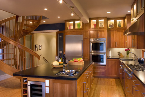
Can you see the little wine fridge in the island there? It occurred to me that since we're going for a relatively high end look for this kitchen which fits with our idea to aim for the DINK market, although we don't really need one ourselves, a wine fridge might be a nice little addition to add a bit of a luxury element. So I hopped on Ebay and bought me one for $104. It's pretty fancy.

So in short, number 3 on the plan is supposed to be the wine fridge. Technically, it should fit according to the measurements, but it will be a bit of a tight squeeze so I'm not totally confident.
4) I've made a 1-metre-wide refridgerator space, which is just wide enough for our side-by-side fridge and freezer. I figure that should be ok, right? We will probably construct some VJ walls to cover the sides of the fridge so we don't have to look at anything but the front of it.
5) The little dotted lines represent overhead cupboards. Number 5 is the overhead cupboard I marked A on the measurement drawing. Because we've got such high ceilings but only a limited number of actual overhead cupboards, I figure I might bump up the storage (and display) space and add a bit of height by slotting in a couple of simple shelves at the height that overhead cupboards would normally start at, and then have the cupboards attached a bit higher. At this stage, I'm thinking we could store regularly used items (such as plates and glasses) along them, and even my pantry storage jars from our last house (that I still have to post about), since we won't actually have a dedicated pantry in this house.

6) This one is the overhead cupboard I labeled B. I think this might be the one with the glass doors, so I'll obviously have to be careful that anything I put in there is pretty (and orderly) enough to be displayed. I might even think about covering up the glass with chalkboard paint or corkboard so we can use them as a bit of a noticeboard. Undecided about that.

7) This one is the smaller overhead cabinet. Again, we'll run shelves underneath this overhead cabinet (plus the one next to it) to add a bit more storage and height.
8) Again, this is another overhead cabinet, but it's the one that used to sit over the rangehood at the house we got them from, so it's a bit shorter than the rest. We might make sure its top lines up with the tops of the rest of the wall cabinets, and then put the microwave underneath it on one shelf (which hopefully should also line up with the other under-cabinet shelves we're going to build). Won't that be neat?
9) I wanted to maximise the length of the bench that separates the kitchen from the dining room, so didn't want to make the entry to the kitchen too wide. 800mm is probably a litle bit narrow, but is certainly wide enough to fit a human through.
10) I've drawn in a little shelf area where we might be able to position a water bowl and food bowl at the bottom for Allie (plus some extra shelves above), like this:

11) One of the MUSTS was to have the dishwasher near the sink, and this is pretty much the only possible location for it where a person will still be able to fit in front of the sink. It's even possible that the space I've left in the corner near the sink is still not big enough, so Allie may have to lose her little bowl area (10) if we need a bit more space. We'll test the space a bit before we make that decision for sure.
12) If my drawing is accurate enough, we may just be able to fit another part of the cabinet that we stole the drawers from [(2) above] in between the dishwasher and the corner sink cabinet.
13) I thought I was being so ultra clever when I first drew the corner where the sink would go (because we don't have any corner cabinets left), by slotting in the last section of the cabinet we stole the drawers from [(2) and (12) above] with the doors facing outward, towards the dining room. So although this would mean we couldn't access the space from inside the kitchen, we could access it from the dining room as a bit of extra storage and not waste it. But then I realised that that corner wall is actually the end of our little kitchen extension, so it doesn't actually back onto the dining room. It backs onto our back stairs that won't actually exist anymore once we build ourselves new front stairs. So we may just leave the doors off that cabinet entirely, and have it open from the kitchen side. A lot of it will be taken up with plumbing for the sink and dishwasher anyway, so we're not losing a great deal of usable space, really.
14) Again, we don't really have the perfect cabinet for the space to the right of the sink next to the hutch. One of the doors from the cabinet that used to hold the sink at the house we bought our kitchen from will almost span the width of that space, so we may be able to reconfigure that cabinet a bit to fit in there nicely. My hope for that area is to have a draining board above it that you can lift up to reveal under-counter rubbish bins, so depending on how we configure that arrangement, we may not even really need much access in there via the cupboard door.
Actually on the topic of the rubbish bin (I know, such a fascinating subject, isn't it?), I discovered this blog that talked about the dilemma they had searching for the best way to accomodate their kitchen waste. They found this in-counter bin by Poh Joo that not only has a lid and a stainless steel ring to hold a plastic bag in there, but a drain hole at the bottom connected to the sink waste so it can be washed easily! How amazing is that?!!!

I'm loving that concept, so will have to figure out whether we can do something similar next to the sink. It might not work with a draining board above it because that will limit access, but we'll see what we can figure out.
So there you have it. And thank you for staying with me through this very very VERY lengthy description of what I'm thinking for the kitchen. I'm so happy (jubilant you might say) that I've managed to come up with a plan for the cabinetry that may actually work, and potentially look quite spiffy and professional! Considering it will all be at a mere fraction of the cost of a brand new kitchen, that will be pretty amazing.
And now the task of actually turning that dream into reality looms before us. First step would probably be to finish the second coat of paint on the kitchen walls, huh? Then maybe we can deal with the rest. Stay tuned, it's going to be yet another fun learning process!

No comments:
Post a Comment